When we think of the web, we think of what we see. We praise beautiful layouts, intuitive visual cues, and stunning graphics. But this is only half of the picture. The most engaging and effective web applications don’t just look good; they feel good. And a huge, often-missed component of that feeling is sound.
My name is Evan Howard, and I’m a sound designer. For years, I was responsible for the entire auditory experience of csgofast.com, one of the most popular and high-stakes CSGO gaiming sites like https://csgofast.com/. In a digital environment where every click holds weight and every second is charged with anticipation, I learned a critical lesson: sound isn’t just decoration-it’s a fundamental part of the user interface that confirms actions, builds excitement, and creates a truly immersive world for the user.
In this article, I’ll share the core principles I learned from designing sounds for a fast-paced, high-traffic web application. I’ll show you how to apply them to make any website or app more intuitive, satisfying, and memorable.
Part 1: Why Sound on the Web is No Longer Annoying
Let’s be honest: web audio has a bad reputation. We all remember the “bad old days” of websites that would blast auto-playing MIDI music or jarring sound effects on page load. It was intrusive and, frankly, annoying. Modern UI sound design is the exact opposite. It’s not about forcing an audio track on the user; it’s about providing subtle, purposeful, and valuable auditory feedback.
When done correctly, sound becomes a silent partner to the user, enhancing the experience without ever demanding the spotlight. It operates on four key levels: Confirmation, Alerts & Errors, Guidance & Flow, and Brand Identity. Let’s look at some high-stakes examples from my work to see this in practice.
Case Study – Sound Design in High-Stakes Gaming
Nowhere are the principles of sound design more critical than in a fast-paced gaming environment. Every sound has to carry information and emotion simultaneously.
The Crash Game – Building Unbearable Tension
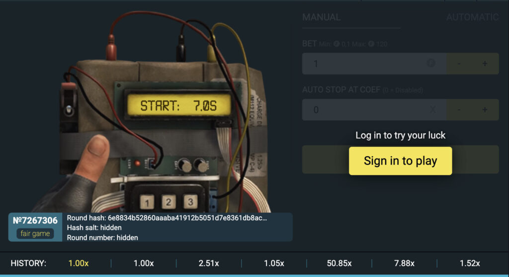
The “Crash” game is a masterclass in tension and release. The core concept is a rising multiplier that can “crash” at any moment. The sound design had to mirror this perfectly. We started with a low, pulsating hum that grew in pitch and intensity as the multiplier increased. We layered this with an accelerating clicking sound, like a geiger counter near a radioactive source. This combination created an almost unbearable sense of rising tension. The user’s successful “cash-out” was rewarded with a crisp, satisfying “cha-ching” sound, while the crash itself was an abrupt, deep electronic “crunch” followed by a moment of silence, amplifying the feeling of loss.
Roulette – The Sound of Pure Chance
I’ve already mentioned the roulette wheel as an example of narrative flow. The soundscape here is layered. It begins with the satisfying, heavy clink of bets being placed on the table. Then, the central element: the sound of the ball. It’s not just one sound, but a sequence-the initial clatter as it’s released, the hypnotic, rhythmic spinning as it circles the wheel, and the frantic, chaotic bouncing as it loses momentum and falls into the pockets. Each stage has a distinct audio character that builds anticipation towards the final, definitive chime for a win or a muted, softer sound for a loss.
Slot Games – A Symphony of Small Wins
Unlike Crash, which is about one big moment, slot games are about creating a continuous sense of action and reward. The primary sound is the spin itself-a smooth, mechanical whirring that’s pleasant to hear over and over. Each reel stopping has its own soft “thud,” creating a 1-2-3 rhythm. The real magic is in the rewards. We designed a whole library of sounds-from a simple, short jingle for a small win to a more elaborate, multi-layered musical flourish for a jackpot. This creates a positive feedback loop, making even small wins feel exciting and encouraging the player to continue.
Part 2: The Sound Designer’s Toolkit for the Web
Understanding why sound is important is the first step. The next is understanding how to create it effectively. This doesn’t require a Hollywood-level recording studio, but it does require adhering to a few key principles.
Principle 1: Subtlety is Everything
This is the cardinal rule of UI sound. The sounds you design should be short, crisp, and clean. They should almost be subconscious-felt more than heard. We are not composing a film score; we are designing micro-interactions that happen hundreds of times in a session. The best UI sound is one that the user would miss if it were gone, but doesn’t actively notice while it’s there. Keep your sounds under a second long, and focus on clarity over complexity.
Principle 2: Create a Cohesive “Sound Palette”
Don’t just grab random free sounds from the internet. A great audio interface feels like a family of related sounds. This is your “sound palette.” It should match the personality of your brand. Is your app slick, modern, and techy? Your palette might be based on clean, electronic clicks and chimes. Is it a wellness app? Perhaps soft, organic sounds like water drops or wooden blocks would be more appropriate.
Define roles for your sounds:
- Positive Action (Success): A slightly higher-pitched, pleasant sound.
- Negative Action (Error/Failure): A lower-pitched, dissonant, or “duller” sound.
- Neutral Action (Click, Toggle): A simple, clean, and unobtrusive click or pop.
- Notification: A distinct, attention-grabbing (but not alarming) chime.
Principle 3: Performance is Paramount
On the web, every kilobyte counts. Your sounds must be incredibly lightweight to ensure they play instantly and don’t slow down your application. A sound that plays a half-second after a click feels broken.
- File Formats: Use MP3 for most sounds due to its excellent compression. For very short sounds or those that need to loop perfectly (less common in UI), WAV can be an option, but be mindful of the file size.
- The Technical Side: Modern developers have access to the Web Audio API, a powerful tool in every browser that allows for precise control over audio playback, timing, and effects. It’s a far cry from the old
<audio>tag and is what makes professional-grade web sound possible.
Part 3: Practical Application & The Golden Rule
So, where should you actually put these sounds? The goal is to enhance, not annoy.
Good places to start:
- Primary buttons and critical links (on click, never on hover)
- Toggles, switches, and checkboxes
- Form submissions (a “success” sound for completion, an “error” sound for failure)
- Notifications and alerts
- Adding/removing items from a shopping cart or list
- Pull-to-refresh actions on mobile web
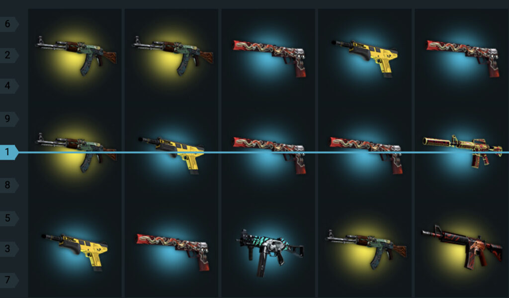
- Insights into the psychology and design behind the thrilling sounds of case openings – each click, spin, and reveal carefully crafted to enhance excitement. You can explore and experience such sound design firsthand on this page: https://csgofast.com/game/cases
This brings me to the single most important rule in all of UI sound design.
The Golden Rule: ALWAYS Give the User Control
You must respect the user’s context. They might be in a quiet office, on a bus without headphones, or simply not in the mood for sounds. A clear, easily accessible Mute or Volume Control button is not optional-it is essential. Giving users control builds trust and shows that you respect their experience. Let them choose to be immersed, and don’t punish them if they can’t be.
Conclusion – Start Listening to Your Interfaces
For too long, we have designed for the eyes and ignored the ears. Sound is a powerful, emotional, and deeply intuitive layer of design that can transform a functional tool into a delightful experience. It adds texture, confirms actions, reduces cognitive load, and forges a stronger brand identity.
My challenge to you is this: start simple. Pick one primary button in your application and add a single, satisfying click sound. See how it changes the feel of the interaction. Notice that small boost of confidence it gives you.
The next frontier of web design isn’t just about what we see, but what we hear. It’s time to stop building silent websites and start designing true experiences.